


One great place to put your heightened awareness1 to good use is to stay on the lookout for good signs … "signs that make you go hmmmm". Before there were smartphones, I always carried a small camera on bike rides, because at 15mph, you can notice far more than at 45mph. And now in the smartphone era I've got my phone configured for pretty instantaneous snapping (on Android: double tap power button, then use either volume button to snap the photo).
I wanted to share a collection of signs that capture where we are as a society, covering the spectrum from 👏applause-worthy to 🤦face-palm-worthy.
The Good
These are the signs that show how we are moving in the right direction as a society.
Adding Value
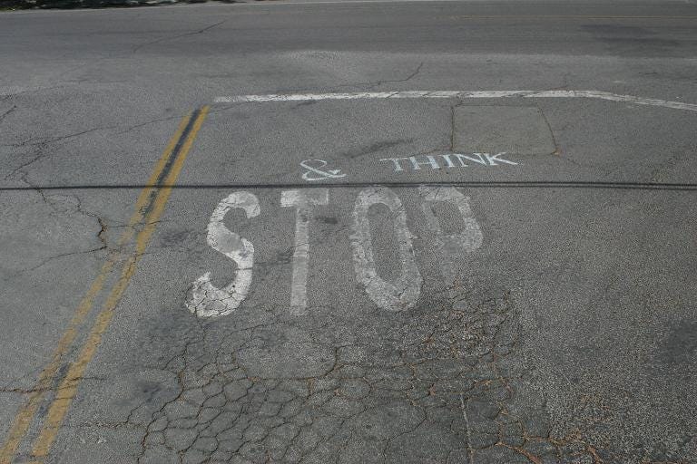
I love concept artists that add creativity to everyday items. I saw this on a trip to Napa with my wife, and then on the next trip down that road, I snapped a photo of it. This ended up inspiring the site image I use for uplevel pro. A stop sign graphic is most commonly used in a negative way. So I love how "& think" turns it into a positive, celebrating the value of taking a pause to reflect and process.
Hidden Danger
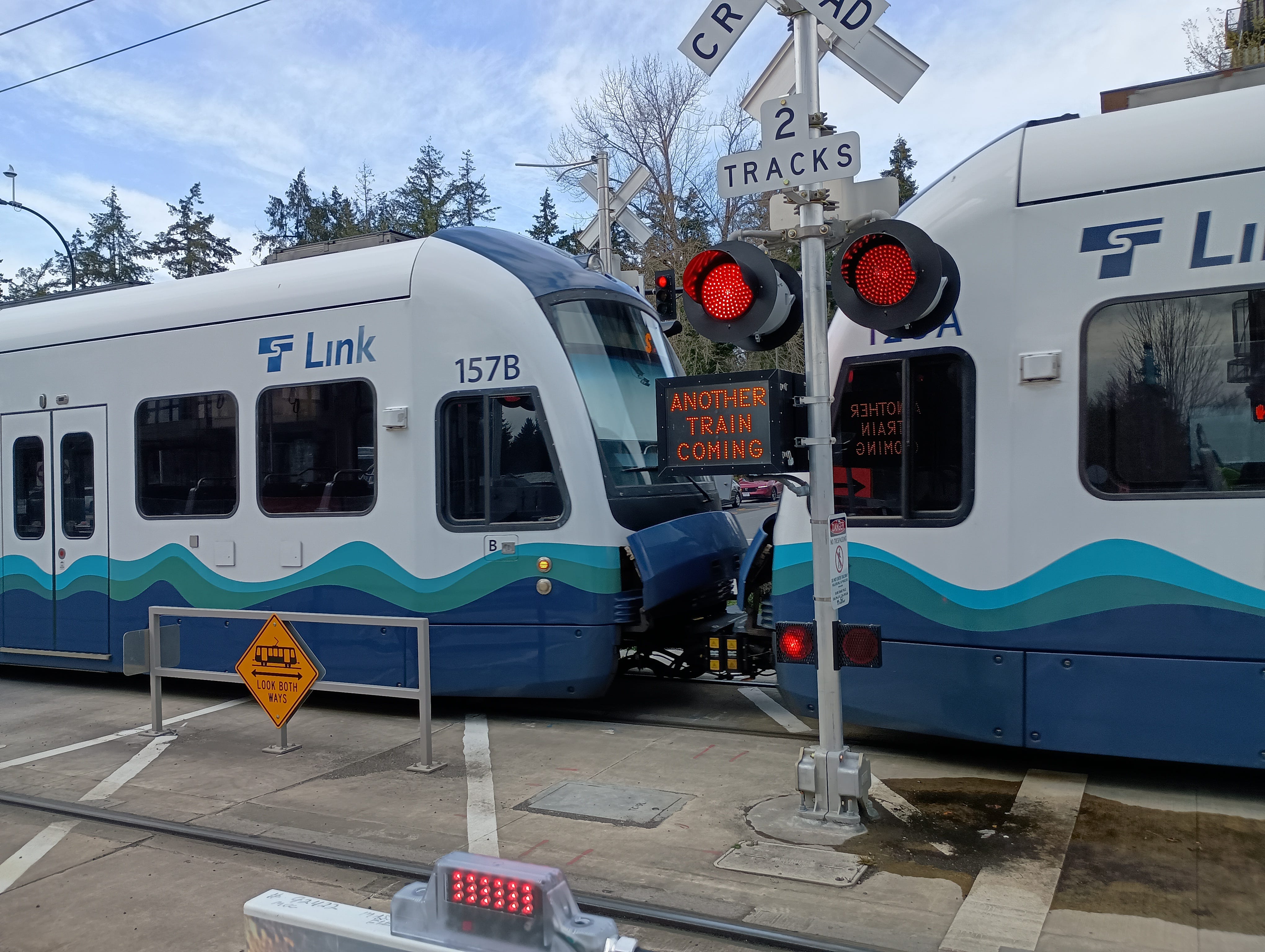
I was biking through a part of our town where the new light rail had started operating. As I was approaching the surface crossing, the train lights started flashing. I stopped and watched a train approaching from the left. Then I saw another sign appear below the red flashing lights: "Another Train Coming." I looked to my right and saw a second train heading towards this crossing as well. "Genius," I said out loud.
This sign is a great short circuiting of our very natural tunnel vision that accompanies our fight or flight instinct. We hear the bells. We look and we see the train. We've now spotted the danger and we stay focused on that to make sure we are a safe distance away from it. But while we are focusing on that, we are losing touch with the rest of our environment. Tunnel vision prevents us from spotting other dangers.
I keep a picture of this sign by my bike hanging in the garage. Every time I'm out on my bike, there are inevitably fight or flight moments. And the more that I can be mindful of "another danger coming", the less likely I am to hyper focus and miss other valuable cues. Where have you missed another train coming?
Eye-Catching
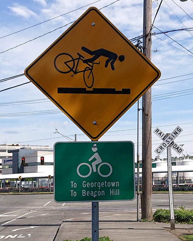
The standard yellow diamond road hazard sign is so common that it's easily tuned out. So kudos to this Dept of Transportation idea to add a very non-standard graphic to this road hazard sign in hopes of getting the biker to take it seriously. Railroad tracks are not friendly to narrow bike tires. And if you are unlucky enough to have your tire fall in the gap between pavement and rail, you very quickly copy the stick figure in this sign.
The Bad
Are we over-reliant on technology? Are we collectively less aware as vehicle operators than we were, say, 30 years ago? These are the signs that give "yes" answers to both of these questions. And the general approach to addressing this problem seems to be: use more signs to draw your attention to the first sign.
Go Bigger
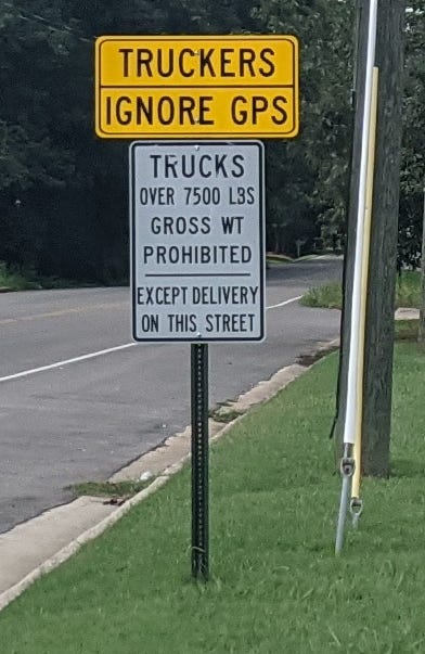
It used to be that "Trucks Prohibited" signs were recognized and heeded. But now with GPS, it's all about following the blue line on the screen. No judgment necessary: GPS told me to do it. GPS told me to drive up this forest service road. GPS told me to drive onto a tarmac. GPS told me to drive into a lake. The phrase "trust but verify" comes to mind here.
I'm not sure how much more attention truckers pay to this sign now that the larger text and different color are there to draw their attention. This minor change suggests that the punishment (to driver and to road) is not that severe for this particular infraction. The next sign is clearly more urgent.
Go Even Bigger
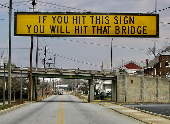
Much like with the "Trucks Prohibited" signs, "Low Clearance" signs used to be notice enough. But clearly there's a trend in ignoring clearance signs, with rather catastrophic results. There's a bridge in Durham, North Carolina that has this happen so much, they've even made a website2 that features the "best of" the crashes that have happened when this sign is ignored.
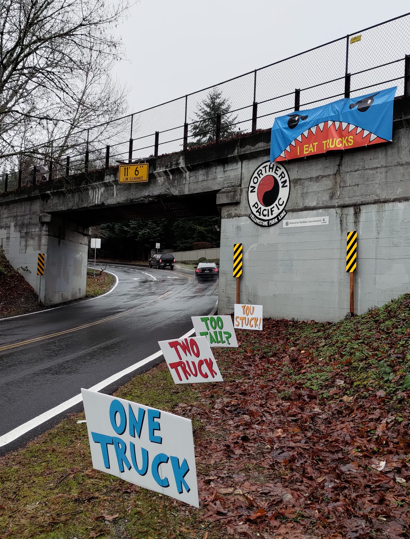
Closer to my neighborhood, here are the attempts to stop more destruction. And since this particular bridge is now a bike trail overpass that I use somewhat regularly, I am hopeful that their Seuss-ian approach works.
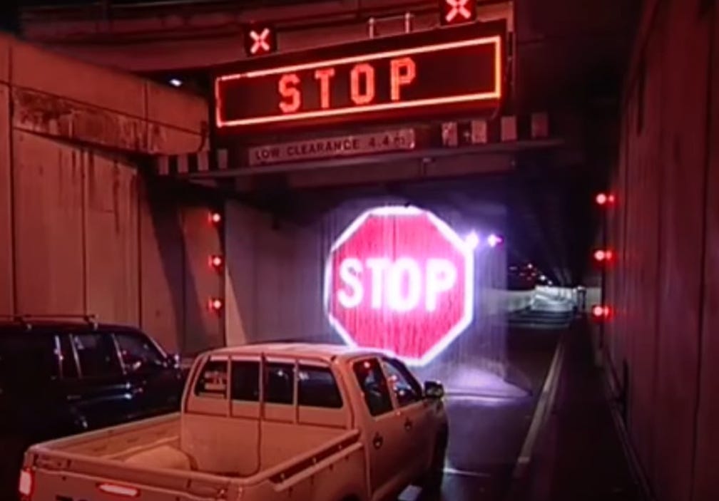
This is Sydney's solution to non-heeded "Low Clearance" signs3. It's a "water curtain" where water pours down to create a screen, onto which a huge stop sign is projected.
Or maybe we can just get to driverless cars sooner?
The Ugly
This last category captures the signs that actually depress me to see. In Energy Flywheel4 terms, these are definitely energy takers for me. I read these signs and ask, "please, we don't really need this sign … do we?"
Really?
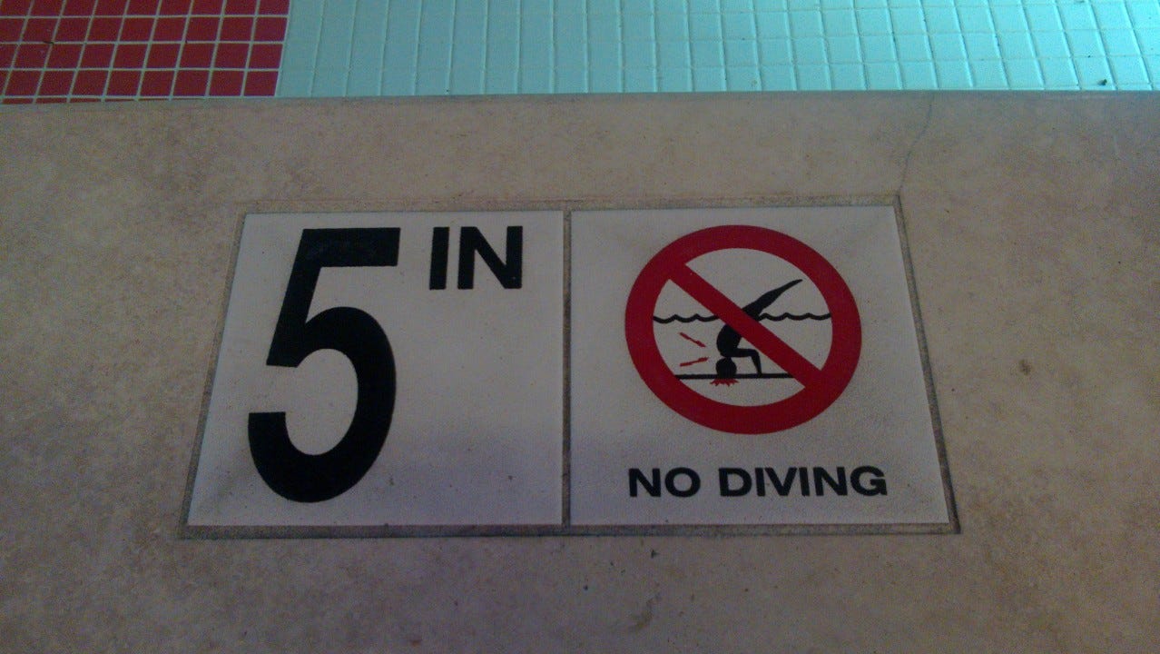
This sign can be found on the pool deck at the hotel my family and I stayed at in Atlantic City, New Jersey. Compliments to the sign maker for capturing the head trauma that can come from not heeding this sign. But, seriously, if you think that a five inch pool is deep enough to dive into, then maybe the head trauma has already occurred. And if a hotel has to put such a sign in for legal reasons, that suggests a more widespread head trauma.
Really???
In my continuing quest to have my phone be less distracting, I was scanning through the more obscure settings and features of my Android. I found a "Heads Up" feature, and when I went in to see what it does, I was greeted with this screen:
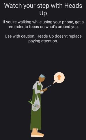
I love this closing line: "Heads Up doesn't replace paying attention." I read this and thought to myself, "please let this be the least used feature ever on a phone." But then I thought of all the stories about pedestrians walking into crosswalks and being hit because they had their eyes in their phone and missed the DO NOT WALK sign.
I have a suggestion for Google to simplify this feature: change the opening message to, "If you're walking while using your phone, stop doing one or the other."
I continue to be on the hunt for signs worth snapping. I am eternally optimistic that I will find more in "The Good" category. But, realistically, I'm sure I'll find a couple more for The Bad and The Ugly. What facepalm signs have you found?
Footnotes
Undefeated Bridge: Undefeated - The Toughest Bridge in the World (YouTube); and the associated website https://11foot8.com.